The G.O.A.T. Sport
Medicine Clinic
Company Bio:
The G.O.A.T., is inspired by excellence. The mission of the clinic is to bring healing of all forms, but with a major emphasis on sports medicine. Located in Sherwood Park, AB.
It's all about the experience; from the moment you walk in, to the moment you leave, the environment exudes relaxation and luxury. The goal is to help patients become their best self, achieve optimal performance and become the master of their craft.
Through services like: Acupuncture, Massage, Nutrition, Chiropractor, Sauna, Cold Plunge, & more..
Business Type:
Sport Medicine, Clinic, Acupuncture, Massage, Chiro, Nutrition, Wellness, Cold Plunge, Sauna
Client Brief:
Lyndsey the clinic owner came to me for advice on her logo designs when she was exploring options. We discussed the values and vision behind The G.O.A.T. Sport Medicine Clinic at length and I took everything I learned about the business to create a logo suite for her with many variations for different applications. She requested a high contrast, masculine, modern feel and decided to keep the colour palette black and white in order to make a bold impact. All photography was to be kept black and white and we even discussed the clinics interior design and how for maximum brand impact it would be awesome to keep it quite dark, moody, and serene. I love the choices she made and honestly it made it easy for me to understand how best to design the branding to match the vibe of the clinic!
Projects Completed:
Brand Identity Design & Business Card Design
Brand Keywords:
Sleek, Modern, Bold, Luxury, Relaxation
Brand Voice:
Professional, Knowledgeable, Mindful


Branding Design Decisions
As discussed the branding was designed around the values and vision for The G.O.A.T. Sport Medicine Clinic. Things that inspired the design: balance, yin & yang, meditation, mind, body, spirit, masculine, sleek. Below is some of the exploration at the drawing phase, I had come up with 4 concepts that were presented to the client, we trimmed it down to 2 and then we finalized the final chosen option.
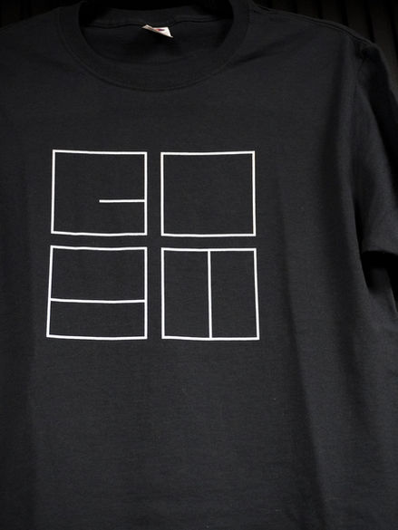
The squares have lines within to spell GOAT, they symbolize building blocks, balance and harmony. Just like coming to the clinic you take steps (building blocks) in order to better your health and wellbeing. We stack those together in order to eventually become the G.O.A.T. (greatest of all time).
Fonts:


Logo Exploration:

Phase 1: Drawing
My initial exploration usually begins on paper

Option 2
Option 1
Option 4
Option 3
Phase 2: Digital Draft 1
Feedback: Option 1 & 4 - Chosen to move forward &
"the" needed to be added to the names

Option 2
Option 1
Phase 3: Digital Draft 2
Feedback: Option 2 is the final choice for final logo designs

Phase 4: Finalize Final Designs in White & Black
Feedback: Looks great, only revision was to add a period
after the 't' in GOAT.
Colour Palette:
True Black
Muted Grey
Pure White
The colours chosen reflect the boldness of this brand, by keeping it incredibly simple it allows the rest of the elements to stand-out and shine. Their services and clinic reflect this luxurious and sleek modern look.


